EMCAN Branding Case Study

Client Overview

EMCAN is a fast-growing entrepreneurial and learning platform dedicated to empowering individuals with knowledge, resources, and a community-driven ecosystem. Their mission is simple:
“From vision to venture, from learning to leadership.”

But EMCAN needed more than a mission—
they needed a visual identity that communicates ambition, momentum, and transformation.

They approached Nexus 7 Creatives to redesign their brand identity into something modern, confident, and future-ready.

Project Goals

EMCAN wanted a brand identity that reflects:

  • Movement + Growth: A visual system that captures momentum and progress

  • Community + Support: A warm yet professional presence

  • Uniqueness: A brand that instantly stands out in the education/entrepreneurship space

  • Digital-first usability: App icons, social media, banners, and UI compatibility

So we set out to build a dynamic, fluid, and expressive identity system.

The Big Idea: “The Ribbon of Possibility”

The hero of this brand is the flowing ribbon-style letter “E / n-wave”, a visual metaphor representing:

  • Growth

  • Adaptability

  • Transformation

  • Forward motion

  • Collective progress

This identity builds the story:
“Emcan. You Can. We Can.”
A powerful message of empowerment woven into the very DNA of the design.

Logo Concept & Symbolism

The redesigned Emcan logo is built around a fluid ribbon form, representing:

  • Continuous learning

  • Never-ending growth

  • Community movement

  • Flexibility in the entrepreneurial journey

The gradient blue & orange blend creates a dynamic, premium feel — modern yet warm.

The app icon version is clean, glossy, three-dimensional, optimized to stand out on mobile screens.

Color System

The new brand identity uses a bold and contrasting palette:

Deep Royal Blue

Symbolizes trust, intelligence, and authority.

Vibrant Orange

Represents energy, ambition, and creativity.

Clean White

Balances the visuals with clarity and openness.

Together, they create a professional yet motivating visual mood.

Typography & Expression

The typography system carries:

  • Confidence

  • Elegance

  • High readability

  • A premium feel

It works perfectly alongside the sweeping ribbon elements.

Phrases like:

**“Emcan”

“Youcan”
“Wecan”**

showcase the brand’s modular and expressive visual language.

Brand Strategy & Positioning

Beyond visual identity, we crafted EMCAN’s core brand narrative:

✔ A community-first ecosystem

✔ For ambitious learners and entrepreneurs

✔ Built on collaboration, creativity, and progress

✔ A brand that says: “Together, we grow better”

This powerful positioning helped EMCAN shift from a learning platform to an aspirational movement.


Outcome & Impact

After launch, EMCAN now has:

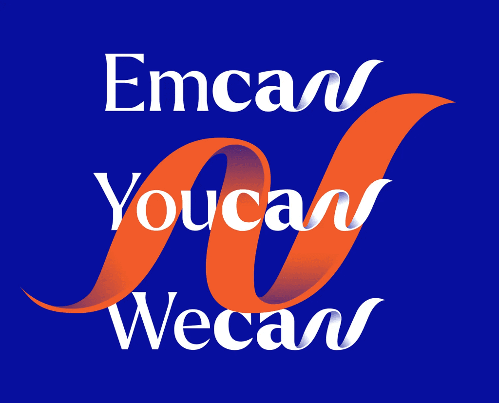
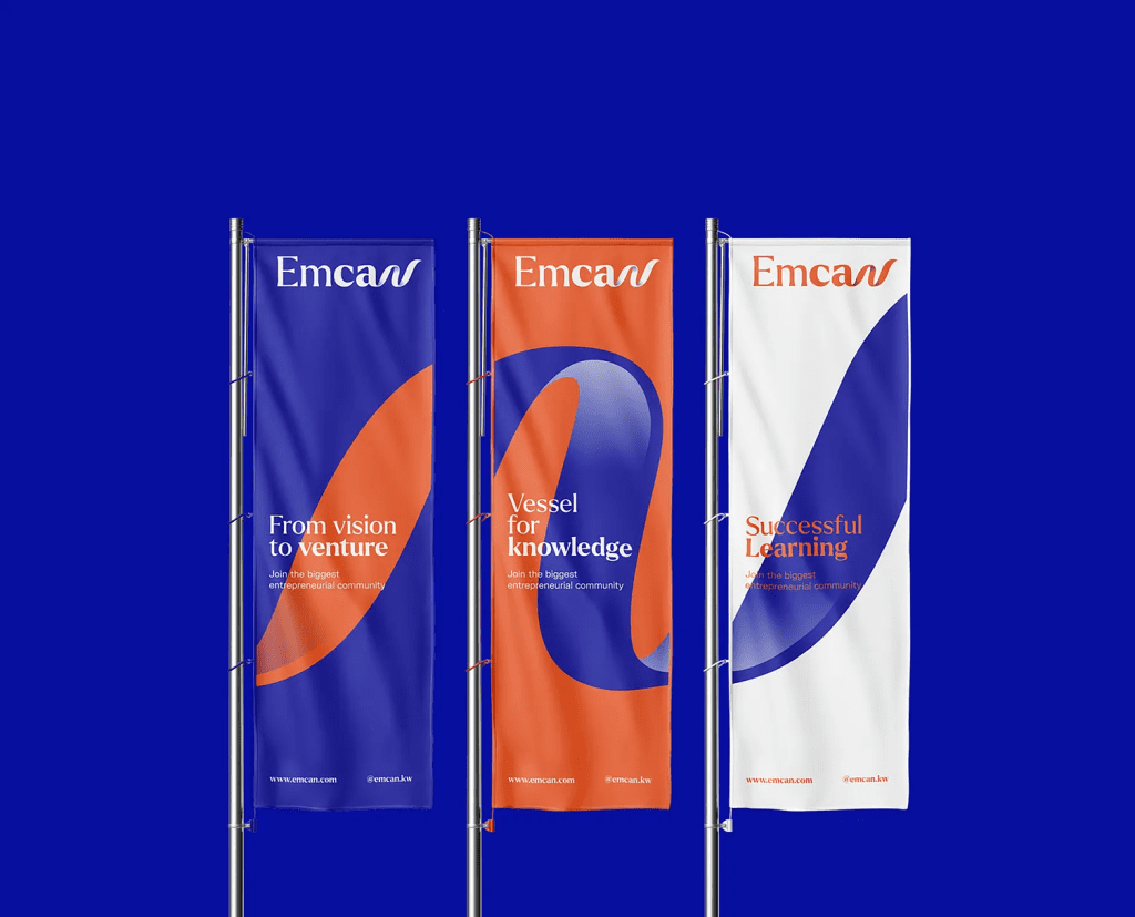
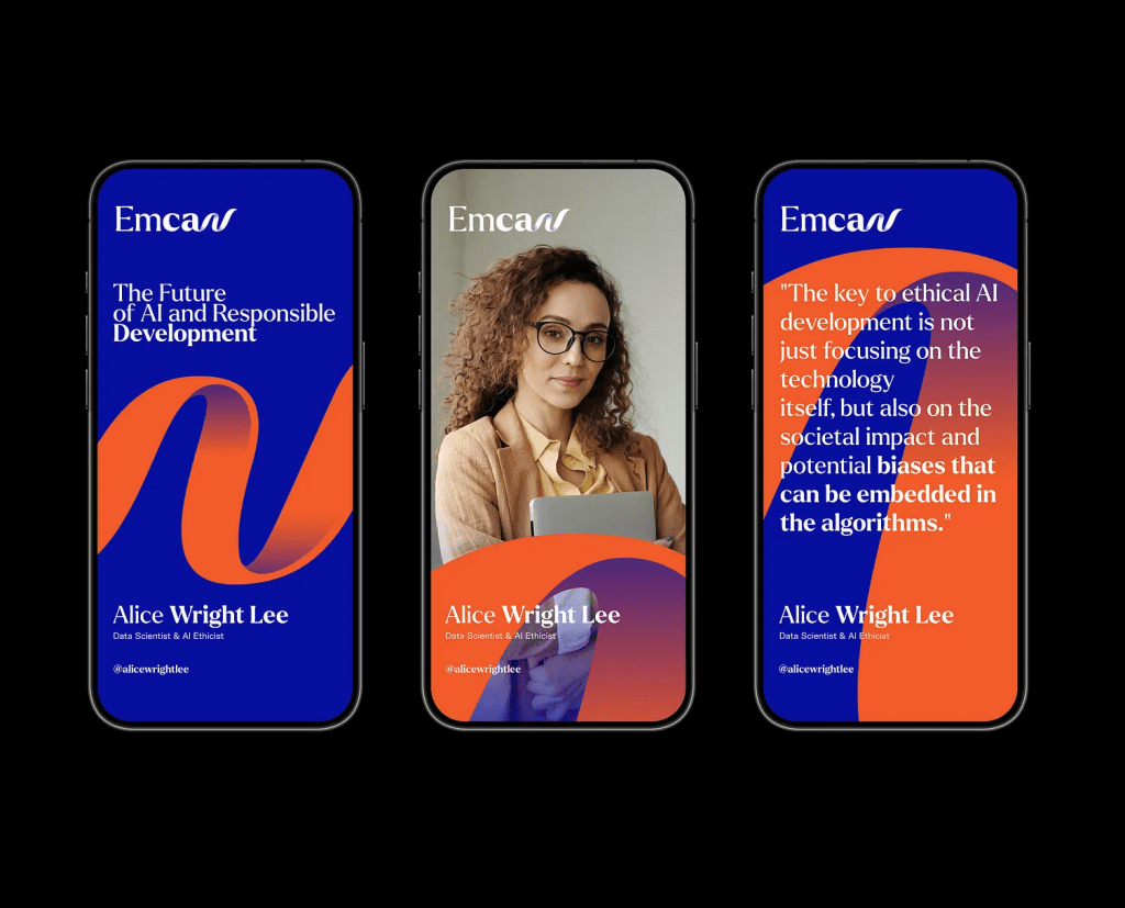
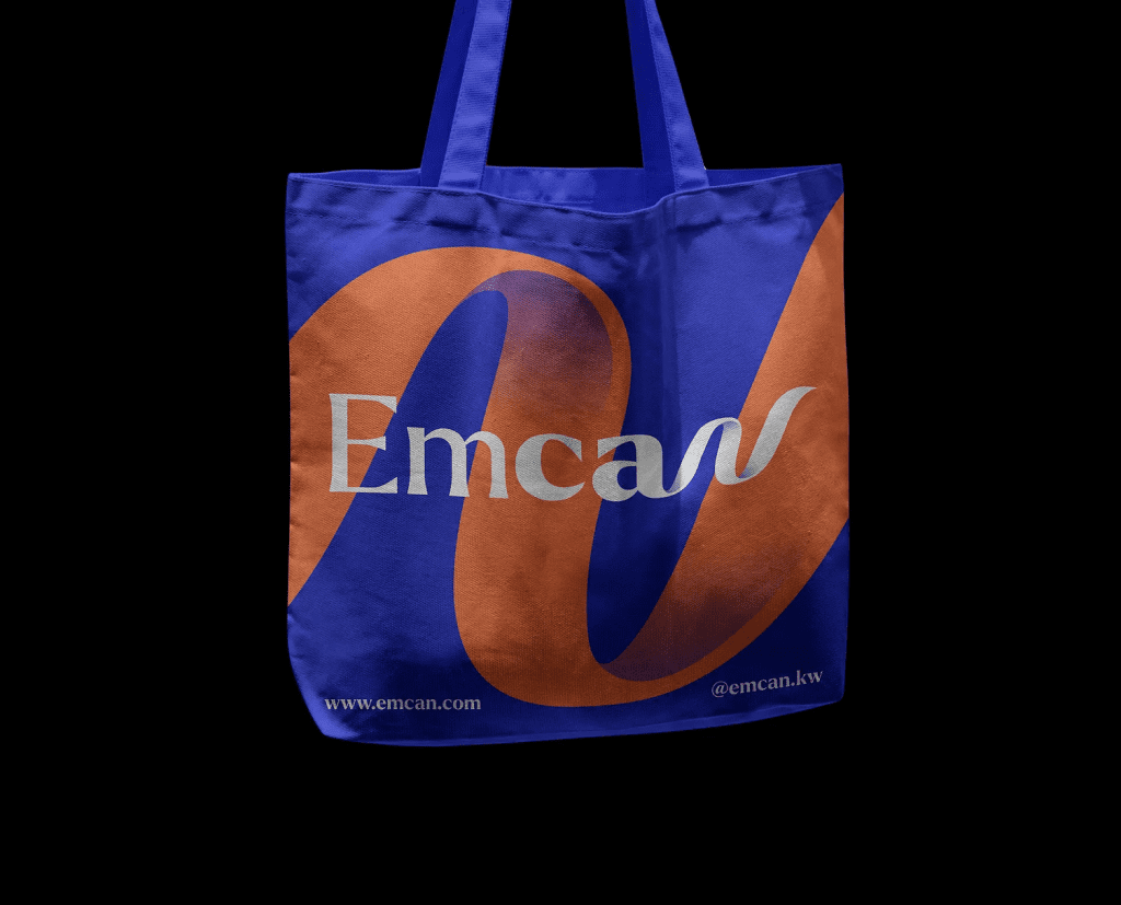
✨ A bold and memorable brand identity
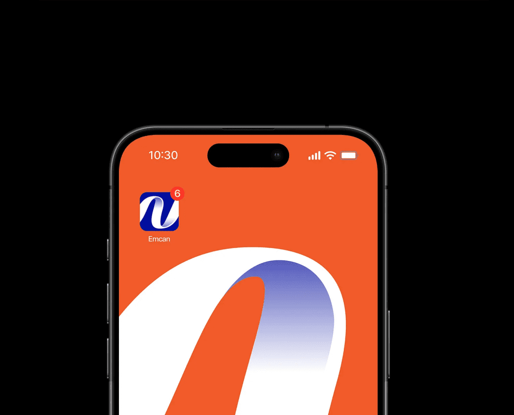
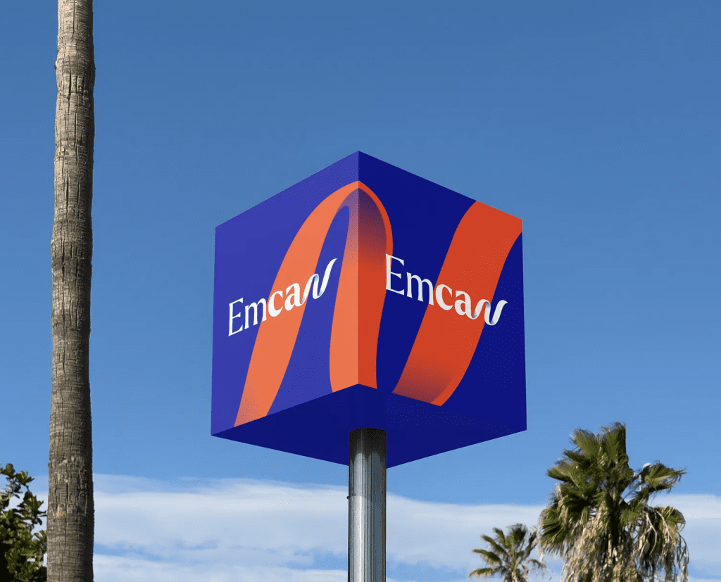
✨ Strong visual consistency across platforms
✨ Enhanced credibility among students & professionals
✨ A recognizable brand symbol and visual language
✨ Better engagement and social presence

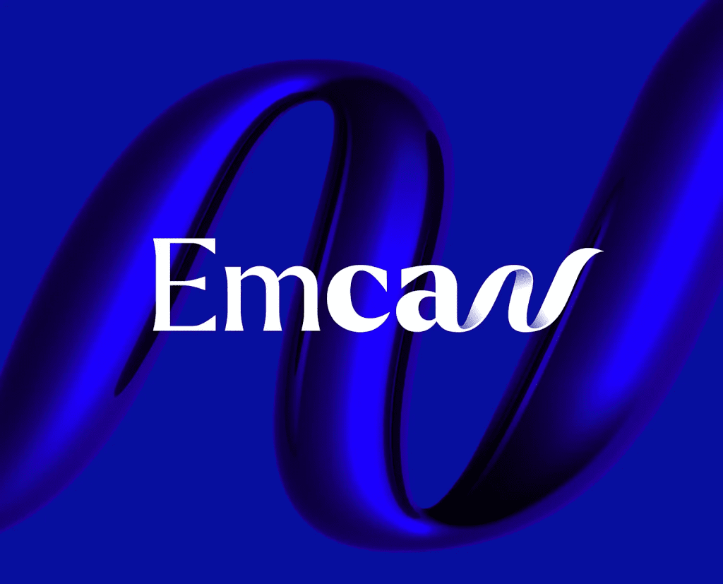
Their new ribbon-based identity now reflects what the brand truly stands for:
growth, empowerment, and collective achievement.

Client Feedback

“Nexus 7 Creatives didn’t just redesign our logo —

they redefined our identity.
The ribbon concept, colors, messaging —
everything aligns perfectly with what EMCAN represents.”


Conclusion

The EMCAN branding system is a celebration of motion, empowerment, and learning.
It gives the brand its own voice, personality, and presence — one that inspires everyone who interacts with it.

At Nexus 7 Creatives, this is what we do:
We build identities that move people and move businesses.

.